
Brand assets
The Iter wordmark, mark, app icon, colors and typeface, with the few rules that keep them consistent. Everything here is for editorial and partner use as supplied.
The wordmark is “iter,” lowercase, and stays quiet. Clear space on every side equals the height of the lowercase letters. Minimum height 20 px on screen, 6 mm in print. Black on light, white on dark; never in a brand color, never over a busy photograph.


The mark is the first letter of the wordmark and is used on its own only at small sizes: favicons, avatars, the app icon. It does not replace the wordmark in editorial use. When you show the app icon in a layout, use the version above, with its corners.


Store icons
Apple and Google each shape the icon themselves, so the store files are square and each platform applies its own mask. Use these only where a platform asks for an icon file, never in a layout.







Iter’s four colors each carry a meaning and are used one at a time, over a neutral ground, as an accent: an eyebrow, a rule, a chip, a button. Never as a filled panel, and never on type.
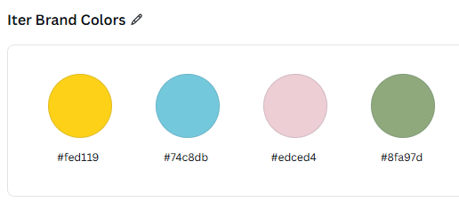
- PlanBright Amber
#FED119Agency, movement. The button color. - PlacesSky Blue
#74C8DBContext, location. Lives inside cards. - Experiences and peoplePetal Frost
#EDCED4Emotion, encounter, the human layer. - InspirationMuted Olive
#8FA97DDiscovery, the unexpected.
- Cream
#FAF8F5Page ground - Paper
#FFFFFFCard faces - Rule
#E6E2DBHairlines - Ink
#1A1A18Type, the dark block
Lufga is a licensed typeface and is not distributed here. For layouts that set Iter’s name in running text, use your own house typeface; the wordmark is always the supplied file, never typed.
Iter learns how you like to travel.
Lufga, one family. Hierarchy comes from weight and size, never from a second typeface. Light for large headlines, Regular for text, Medium for labels and buttons, SemiBold for emphasis.
Questions about usage: press@itertravelapp.net. Iter and the Iter wordmark are trademarks of Iter Travel App LLC.
Do
- Use the files as supplied, at the sizes above or larger.
- Write the name as “Iter,” capitalized in text. The wordmark itself is lowercase.
- Keep the wordmark on a plain light or dark ground.
- Reproduce the four colors with their meanings when you show them.
Don’t
- Recolor, outline, stretch, rotate or add effects to the wordmark or mark.
- Set the wordmark in any typeface, or reproduce it from this page’s text.
- Place the wordmark over the gradient in black, or over photography.
- Use the mark in place of the wordmark in headlines or bylines.
- Imply endorsement or partnership without written agreement.